
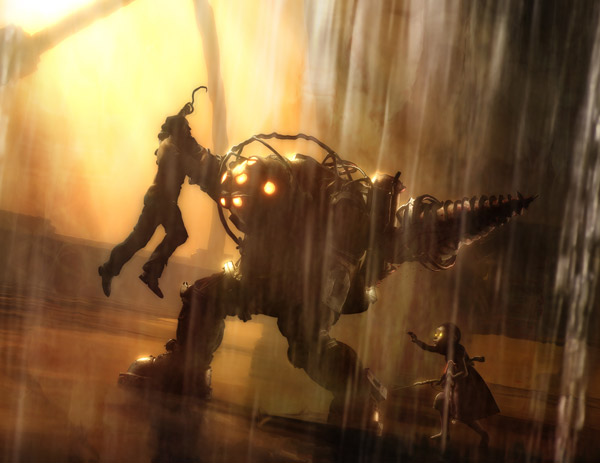
These are screenshots from a game called Bioshock 2. Bioshock is a perfect example of a successful video game design. It not only embodies the use of the basic use of contrast but also the more complex. Bioshock uses a variety of polarities to create a harmonious beautifully done video game. The shift between light and dark, sharpness and diffusion, innocent looking little girls to zombies creates a very intricate story line and catches the players attention. The First photo evokes the feeling of the Pop-out effect, why does this little girl have a weapon? The irony creates curiosity and provokes the user to learn more. The game also uses extreme contrasts in light.
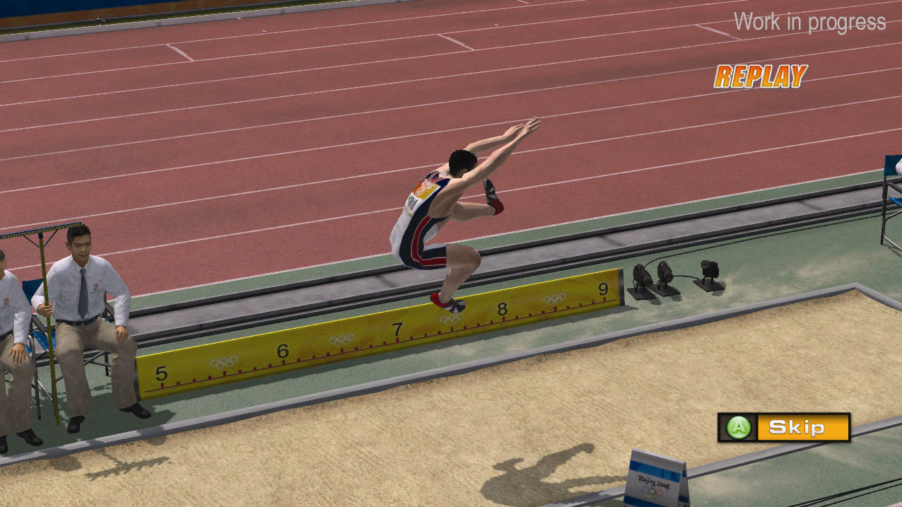
To me, this is a very bland design for a video game. Even though the game's purpose was to re-create the Olympics the overall design and appeal could have been more exciting. This game is a realistic account of the Olympics which fails to create a sense of design. Contextually, there is design considered, but not of artistic/flow/purpose. There is no tricky lighting, abnormal or surreal characters (which is not neccesarily needed, just encouraged for interest), colors, tone, etc. All design principles of contrast all fall in the MIDDLE of the polarities. There is nothing that stands out or creates interest. The colors all follow the same pattern, as well as the shapes, and consistency.

No comments:
Post a Comment